Showing posts with label technique. Show all posts

3/9/14

Bed of Cactus

 
"Bed of Cactus"
9 x 12 oil
 
A friend of mine spotted this truck and sent it to me knowing I would love it! It's funny that I have so many people that think of me when they see something like this. I've been sent photos from all over, but this one just screams Texas.

A painters note...I alternated with very dry strokes and then would switch brushes to a very turp filled brush that would even drip and run to try and get varied textures going. It was interesting. I used to paint stuff and leave it alone, afraid I would mess it up and now that I have more confidence and experience I try different things. If I don't like it, I just take it off or paint over it.

Feel free to scrape and wipe, but don't try and get everything off. What you leave can look interesting and add unexpected textures when you go back into it.

1/20/14

Palette Knife practice

 
"Big Sky"
11 x 14 oil

This was painted from one of my get lost exploring the Texas farm
roads outings that I'm becoming more and more a fan of. The sky looked
exactly like it appears in the picture, with these giant clouds.
I started out painting taking lessons from a instructor that only uses a
palette knife and no brushes. I always use a palette knife for finishing
touches, but it's been a while since I used it as my primary utensil. 
I shared it on Facebook and was surprised at the positive reactions,
considering how quickly this came together.
 
I'm going to make an effort to use the knife more often.
 
Wonderful day!


10/28/13

They won't stay still!

 
Painting Willhoites the local biker hangout in Grapevine, but it's not easy when
your subjects keep riding away. I tool a cell phone picture because I anticipated this,
but the final result is probably a mishmash of the real bikes. I will post the final painting asap.
 
I'm not sure what I'm doing with that little brush. I paint most of my work with a
size 6 to 8 flat brush. You can get into trouble picking up the little ones. Your always
better off abstracting the form down to it's essence and minimizing the little stokes.
Paint as much of it as possible with the largest brush you can.
 
cliff notes...
Big brush = good
Small brush = bad


7/28/13

Saddle Up with a Egbert brush

 
"Saddle Up"
12 x 16
 
Painted this using primarily a "Egbert" bristle brush. ( pictured below )

 This brush has really long bristles and no matter how hard you try it's tough to do really tight overly rendered work. I like to start paintings as loose as possible and feel like it helps to add energy to the piece when it works out, but I don't always use this brush. Sometimes, I use a 1" wide flat that has worn bristles to block in my start. I don't have any set method and I love to experiment.

The start of a painting is my favorite part because drawing is fun to me and one of my strong points since I've been drawing far longer than painting.


7/22/13

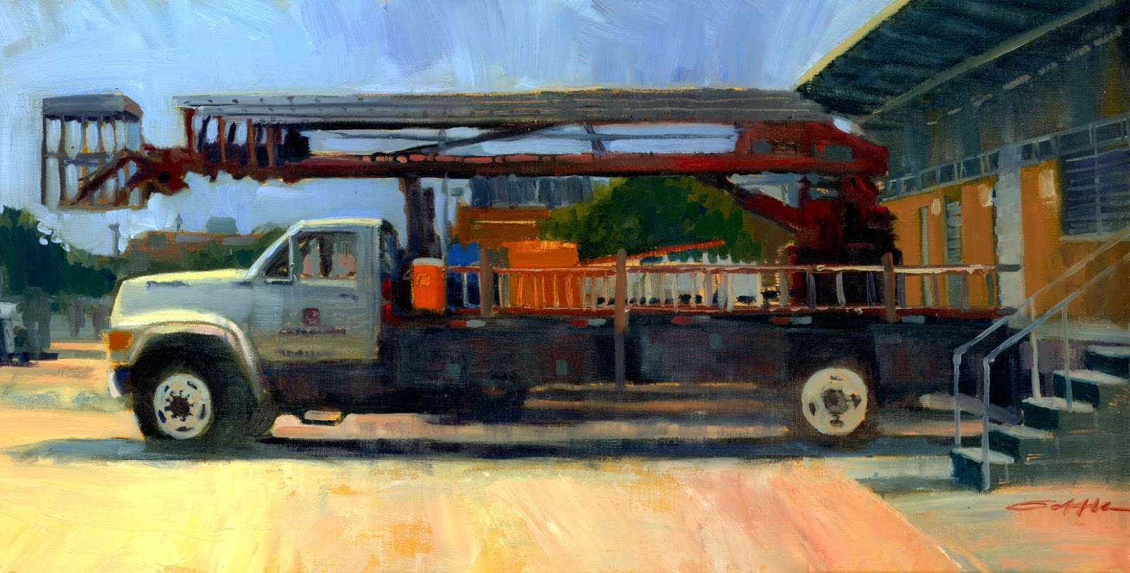
Finding Beauty Where It's Not


"Boom Truck" 
10" x 20"

I have spent the last twenty-eight years or so designing signs for a living. The truck pictured above has become a very familiar view. I took a picture of this install truck while I walked into work one early morning and I thought it would be a fun to try and simplify all the details and to try and create something pretty out of a subject most people wouldn't find that way. I took my time drawing this out because any drawing issues would be very obvious. I started painting in my darks and linking them together to give weight to my subject. The truck was back lit, so I tried to paint a lot of the reflected light and to soften up the edges in my darks because I didn't want them to overpower the color and become a distraction. I saved the hardest edges and the brightest colors for the areas I wanted you to look. This painting became about the implied details and when viewed up close becomes more abstract in appearance.


1/26/13

Video Demonstration "Off Road"

 
"Off Road" Video Demonstration
 
This is my first attempt at filming myself creating a studio oil painting and it's shown in very quick time. The painting took 80 minutes and I've speed it up to 4 1/2 minutes. I've watched many of these types of things, so it was very interesting to see myself. I also figured out some things to make my next one even better.
 
Hope you enjoy it!

6/12/12

The Old Mill


"The Old Mill"
16" x 20"

I've been waiting for the right opportunity to paint this old mill in Grapevine, Tx. I did make two other attempts, but both went south on me for various reasons. I was leaving the new convention center, looked up and caught the perfect orange light streaming across the mill. It was around 8:30 pm and it was the last minute of light from the setting sun. The mill was aglow with beautiful blues and oranges. I painted this in my studio in one sitting the next day.


I used a quick grid to help me draw the layout and then I washed in Indian Yellow and Phthalo Red Rose. Both are translucent colors. I wanted to maintain the glow from the board shining thru for as long as I could.
 Midway point. Every things blocked in and I'm happy with it so far.

In the home stretch. I waited as long as I could before laying in the juicy thick orange glow.


2/19/12

Step By Step Plein Air Tractor

Plein Air 12 x 16

 I will post a better photo after it's dry.


My block in on a pre-tinted canvas. I was using a 3/4" brush and linked all my shadows to solidify the mass. My darks are not all one shade. They shift from cool and warms and I added some Sap green into the mixture in the grass shadows.

My Subject - Interesting to compare photo with final painting and see where drawing errors happened. Much harder to see when your in the heat of the battle.  

I jumped into the details of the tractor because I liked what the light was doing at that moment and it was the fun part to paint. Tried real hard to leave as much of the beginning darks alone to keep my depth.

I used this long haired brush from Ace Hardware for laying in my grass. It puts down a lot of paint and the bristles make long sweeping texture. Not bad for a .99 cent brush. I typically put the most texture in the foreground and spots I want to highlight. You can see the brush I used at the bottom of the painting.
  
You can see the size of the painting in this shot if you can look past my my handsome profile.
 

Working some fence details and adding in the roof. I want the fence to have depth, but I don't get carried away with any one part. Also, I try and keep the darks in the fence connected to the darks in the tractor since they are on the same plane. I paint in my sky last after laying in more trees. After the sky is in, I work the tree branches back on top of the sky. I try to not bring much attention to this area. When I was close to finishing I changed the angle of the house roof on the right side to point back towards my tractor since it is my main subject. ( see final picture )


10/12/11

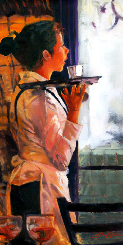
Waiting for You

"Waiting for You"
8" x 16"

This is not my normal subject matter, but I fell in love with the photo my friend Lee Brown took in a restaurant in Paris and I lucked out that he posted it in another one of his now famous painting challenges. Click here to see Lee's photo. Using Photoshop, I cropped the figure tighter and removed the shadowed figure in the right foreground and added a chair in his place. The chair back points up to the figure and helps direct the viewers eye back up to the girl and also also adds weight and depth to the bottom of the painting. I also use a filter in Photoshop called "Median" that blurs the details without losing the shapes. When I'm plein air painting the only way to achieve similar results is to squint at my subject.

I painted my painting only looking at my Photoshop image on my computer screen. I have to admit I was surprised when I finished it and looked back at the original picture because it had tons of details I had lost, but hopefully I did Lee's beautiful photography proud. Thanks for another fun challenge. Make sure you visit Lee's "A Day Not Wasted" blog and see the other entries and tell him "Hi" for me.


8/29/11

Hummingbird Feeder Glow


"Hummingbird Feeder"
5" X 7"

I hoped to capture the hummingbirds quick movements, but what I was most excited to paint was the light hitting the right side and all the secondary reflected light. This was painted very quickly in around 30 minutes.


The light around the bird is the toned board showing through. My most successful paintings seem to be the ones that the natural glow of the board still shows in places. Once that glow is gone, it is difficult to paint back in.


7/27/11

Painting Challenge: Train


"Train Crossing" 
11" x 14"

This painting was done for an online painting challenge from my good buddy Lee Brown over at
A Day Not Wasted. Lee has a great site that features his beautiful photography from his world travels.
I dare you to visit and not get inspired.

This train passes close too Lee's home in Colorado Springs, Colorado. Follow the link to see the challenge photo, the other artist interpretations and to possibly join in the painting challenge fun. Thanks Lee!

This is my second challenge I participated in. Here is my first one.

When I saw the photo I knew it would be a challenge. All the detail caught my eye first, but what I really wanted to paint was the light on the left side and the depth of the distant background. I tried laying down a monochromatic underpainting, but this time I didn't wait for it to dry before applying the color. At first it caused me some grief because the color kept picking up the grey beneath, but in the end all it took was a second round of good clean saturated highlights to not have it too washed out.

How does it look?

7/23/11

Mountain Studio Painting

"Purple Mountains Majesty"
10" x 20"

This was painted from a photo I took in Colorado somewhere between Rico and Delores. If anyone recognizes this location by name, please let me know. It was an unbelievably gorgeous spot.

This was my first attempt using a monochromatic block-in. I let it dry for three days before adding color. I really dropped the ball by not taking progress photos, but I was totally absorbed and fascinated by the technique. I have seen other painter use this method, but to tell the truth it sounded kinda tedious to me. Why paint everything, just to repaint it again with more color? Now I understand and have become very intrigued to try it again. It was much easier establishing my values by using only a dark and middle tone and letting the board show though for my lightest light, than using all the colors on my palette, especially on a much larger than my normal size painting. After I had my values clearly established it was so easy to put on the color. I was able to add color very quickly and it came to life before my eyes. The speed of the coloring process made this studio painting feel closer to my plein air work.

Painting is so fascinating to me. There are so many different methods to apply paint to canvas.


6/21/11

Twilight

"Twilight"         12" x 24"

 This is a studio painting based on some photos I took in Fredericksburg, TX. My wife and I left our boys at the hotel and went off for an adventure. The sun was disappearing right before my eyes, but I managed to snap a couple photos before it was gone. I don't have a lot of experience painting this large or painting from photographs, so this was a challenge. My camera was set on "night photo" and I realized this brightened my pictures and almost made them look like they were taken during the day, so the biggest challenge I had was working from photos without any accurate color. I am also accustomed to painting fast, so I tried very hard to take this slowly. I have mixed feelings about the final work. I'm not sure how much better this version is than the night I first blocked it all in. I think this painting has less paint than my plein air work, even though I painted on it on several different occasions. I think I became cautious and didn't want to cover up all of my previous work. Is this common for all studio painters?

I'm very happy with the method I painted my sun. I simply painted it solid white and after it dried completely I dry brushed yellow on top of the white. I think this made a brighter sun than any solid yellow I could have mixed.


Don't get me wrong, I like the final product. It just feels different working in the studio.
What do you think? I need some input.

2/22/11

"A Good Book"  9" x 12"
This was my first attempt at painting from a live model and to add to that pressure, the model was my wife. I helped organize a "paint in" a few weeks ago and we had a wonderful turn out with around thirty artists painting inside and out. Along with setting up a few still lifes, I somehow convinced my wife to pose for us. I tried to make it as easy for her as possible, so I brought her favorite chair and book with us and posed her exactly the way she looks most nights. She did a great job. ( Thanks again Sweetie! )
I had no idea how my painting would turn out. In retrospect, I jumped in too fast and should have done more pre drawing. Seeing the photo I took side by side reveals my drawing errors, but I do think it looks like her, so that's good enough for me.
This was fun challenge and I hope to do it again. 

 My beautiful wife!

A portion of our group at work

2/12/11

Plein Air Demo Detail

"A Day of Rest" 
12" x 16"

Here is the promised picture of my recent plein air demo.

2/4/11

My Process Demo

After choosing my subject I ask myself why I wanted to paint this particular scene; What drew me to this scene or subject. In this case, it was the tractors disappearing into shadow and the light from the other side. This will be my paintings center of interest and I will remind myself over and over that everything else is just there to support this. I will put the most detail and the lightest light and darkest dark within this area.  

I applied an initial wash to the canvas with Transparent Earth Red thinned down with mineral spirits. I coated the entire board, then wiped it down with a cotton rag, leaving the surface as dry as possible. I don’t always tone my board prior to starting, but I felt the red tone shining through would help unify the overall color tone present on this overcast day.

Still using the Transparent Earth Red, I began laying in my subject. The shape of my board forced me to adjust the building proportions. I felt I only needed to show the corner of the barn to establish it, so I removed much of the width. I wanted to show what was behind the barn to help establish my subject, but used the shape of the tree at left and the roof edge as a natural barrier to keep the viewers eye from leaving the painting and forcing your eye back to my center of interest.


I began blocking in my masses and establishing the darks. As stated above, this was a very overcast day, so I knew I wanted to "grey" out my colors. At this stage there is nothing I can't change, so I play around with my color looking for the right tone.


After everything is blocked in and established you get a sense of what the final painting will look like. At this point I make sure my darkest dark and lightest light is still in my center of interest.


I laid in my background and brought it up to near completion, so I could begin putting in more of the tractor details. This area is starting to receive some of the the final finishing strokes.


With the tractor area basically finished, I turn my attention to painting in my secondary subjects. I now know the level of detail I can paint within those areas. These areas should not exceed the level of detail within my center of interest.


This stage I am fine tuning everything while trying real hard not to overwork any one thing. I used brush stroke direction and slight color shifts to help indicate the wall slats, letting the paint create the sense that there is more detail than I actually painted. I had hesitated putting in the bright orange caution symbol on the back of the tractor because it was a fluorescent orange color in real life and I didn't know if the colors on my palette could duplicate it. I ended up happy that I went for it and succeeded in creating the illusion of this "bright" color, because I had "grayed" all of the other colors.

I will post a better photo of this painting after it is finished drying.


12/15/10

Going Grey

"Going Grey" 8" x 10"

I have been working on adding more greys into my paintings. I have four tube greys that I put on my palette prior to star, mostly to remind myself to use them. Portland grey light, medium and deep, plus Holbeins "Grey of Greys". The first three are colors that Kevin Macpearson uses frequently and the Grey of Greys is a color that I picked up from a Kaye Franklin workshop earlier this year. I try to subtly bend these shades warmer and cooler. The more grey I add, the brighter my main color will appear.

7/25/10

Miniature Painting

"Bird w/ Flowers" 4" x 6"

This was a miniature painting that I painted for my wife for her office desk. I bought a small frame, took the glass out and sanded it and then applied several coats of white Gesso. This made for a surprisingly slick surface that I had problems painting on with my normal Hog hair brushes.  It turned into a fun exercise that forced me to lay the paint down and leave it alone, otherwise it scratched right off. It turned out kind of pretty, especially in the heavy dark wood frame, but I don't think I will be in a hurry to paint on glass again.


7/15/10

Blacksmith Wagon

"Blacksmith Wagon" 9"x12"

I think I made a rookie mistake. 

I changed the brand of my oil paints from Gamblin to Le Franc and my paintings have suffered. I don’t think anything is wrong with Le Franc paints. I know several great painters that predominantly use them. My mistake was to change all of them out and add two new colors to my palette at the same time! I have since read recommendations about adding new brands or new colors to your palette, one at a time. I didn’t think it mattered so much, but I found out it does. Plein air painting is difficult enough, so anything that slows you down or makes you unsure will really cause you problems. I have been struggling with my darks, never feeling they are dark enough. I tried adding Sap Green or Viridian to darken my basic Ultramarine Blue / Alizarin mixture to no avail.  Le Franc paint also feels too light and whipped compared to what I’m used to. All of this resulting in wasting paint trying to get my mixes right. Recently, just adding Gamblin U.B. back has improved my work.  I think I will go back to Gamblin as my primary brand for now and try using the other brands only one or two at a time.

Anybody else experience anything like this?

"Plein Air Artist" web site informed me they are featuring my painting "Porch light" on their front page. It's always nice to get recognition, especially from so many great artists. Thanks Donald! Go visit and join in.

5/27/10

Colorado Landscape

"Gold Rush"  12" x 16" 

This is a painting I did during a recent workshop with Kaye Franklin. She is a wonderful painter and teacher that has taught all over the world. It was the perfect class for me because Kaye uses the same basic color palette as I do with the addition of  Yellow Ochre and Sap Green. Kaye acted a little surprised I had never used the Ochre, but I told her I have used a basic three color palette for some time now. I do feel it's time to start adding some colors, especially ones that will make the plein air work easier and faster. I have always loved Kaye's greys in her paintings and I learned one of her tricks was to premix a few greys that she then adds to her mixes as she works. I think this practice will help me to get more greys into my plein air work.